


Most people who find a local business do it on a phone. Often one handed, sometimes in a truck, sometimes with a toddler on the other arm. A site designed on a big screen and then squeezed down for phones usually shows it.
Mobile first means designing for the phone before anything else, then adding room for bigger screens. Here is what that looks like in practice.
Google looks at your phone version
Google crawls and ranks sites based on their mobile version. If something is missing or broken on phones, it is missing or broken as far as Google is concerned, even for people searching on a computer.
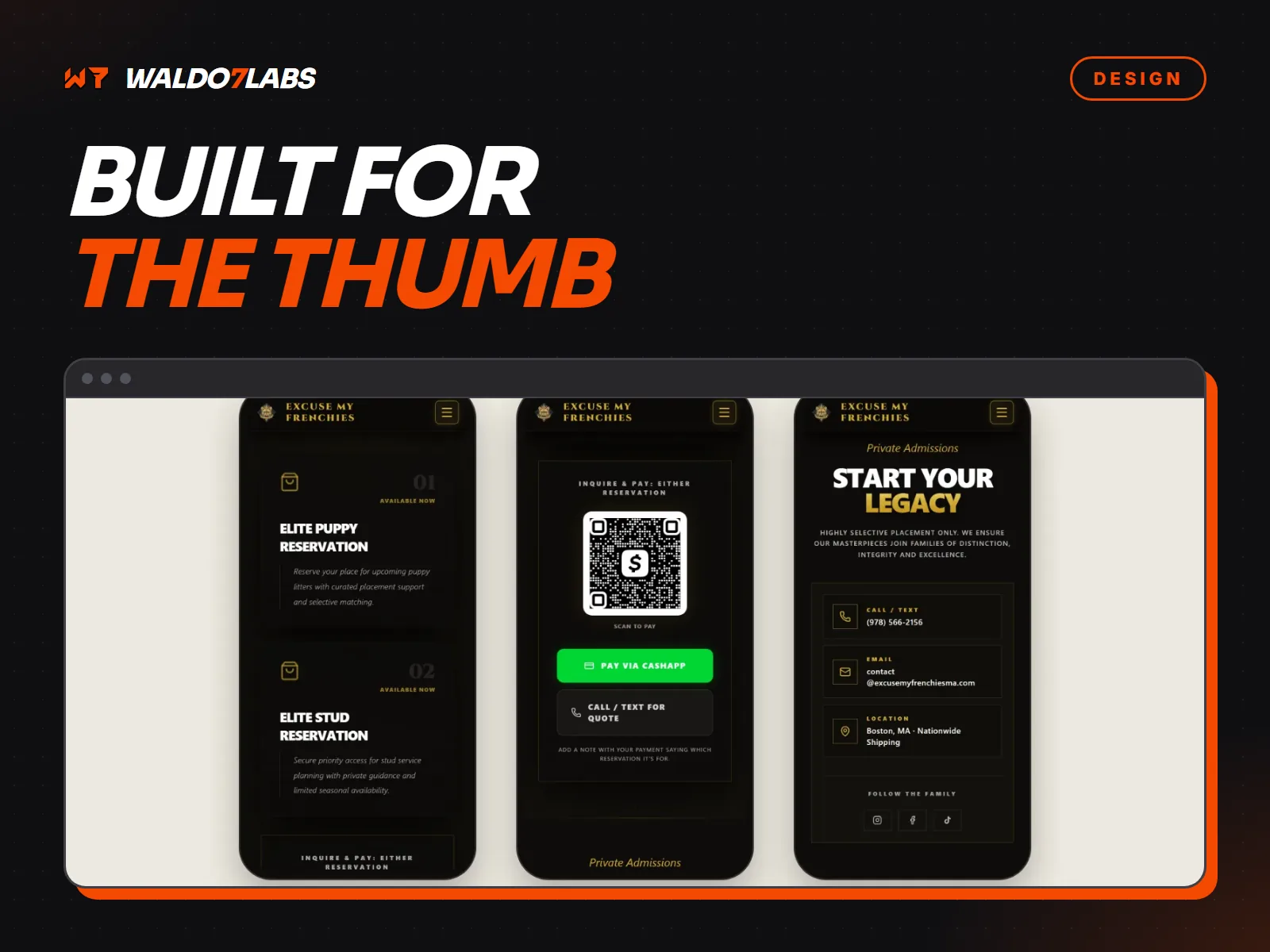
Design for the thumb
Holding a phone in one hand, your thumb reaches the middle and bottom of the screen easily. The top corners are a stretch. That matters for where things go:
- The call button should be easy to reach. A bar fixed to the bottom of the screen with Call and Get a Quote works well for service businesses.
- Important buttons should not sit tight in the top corners.
- Menus should open and close easily with a thumb.
Buttons big enough to hit
Apple suggests tap targets of at least 44 points, and Google suggests 48. In plain terms, about the size of a fingertip, with space around it. Links squeezed together in a line of text get mis-tapped, and people give up.
Text you can read without zooming
Body text should be at least 16 pixels, and so should form fields. On iPhones, smaller text in a form field makes the page zoom in when someone taps it, which throws the layout off.
Forms that bring up the right keyboard
A phone number field should open the number pad. An email field should show the @ key. It is a small detail in the code, and it makes a form much faster to fill in on a phone. Keep forms short too. Name, phone and what they need is usually enough.
A phone number that dials
Every phone number on the site should start a call when tapped. It sounds obvious. Plenty of sites still show it as plain text, or inside an image that cannot be tapped at all.
No hover
There is no hover on a touch screen. Menus that open only when a mouse passes over them, and details that appear only on hover, do not work for phone visitors.
Test it yourself in five minutes
- Open your site on your phone, on cell data, not wifi.
- Count how long until you can see what you do and your phone number.
- Tap the phone number. Does it dial?
- Fill in your own contact form with your thumb. Did it reach you?
- Try the menu and a few pages. Is anything too small, cut off, or scrolling sideways?
Borrow an older phone if you can. Plenty of your customers are not on the newest model. For speed on its own, see Core Web Vitals explained.